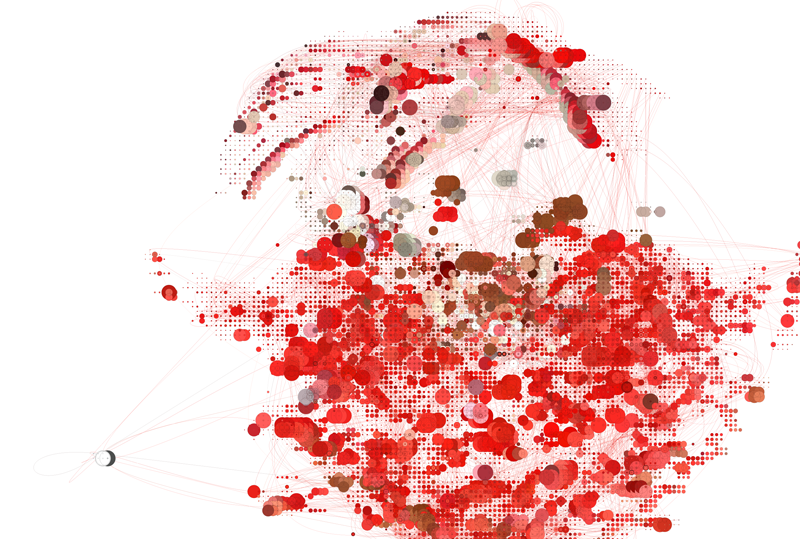
"These images are generated by evaluating and interpreting the 1997 music video “Mo Money Mo Problems” from the first disc of the Notorious B.I.G. album, Life After Death. The algorithm detects edges in the image and attempts to trace motion from frame to frame, using the initial frame as their starting point. The output is rendered as a vector image, the curves represent the motion. The points represent the pixels detected in the edge, their size determined by the distance from their previous location, the further, the larger the circle. The color and location of the points are determined by the corresponding pixel in that frame. The bright colored track suits worn by Puff Daddy and Mase in the dark backgrounds make for good tracking and nice color combinations."
http://nickhardeman.com/blog/?p=244
An example of an entirely aesthetic use of data visualization. This is the sort of thing that seems to get far more attention than other much more useful applications of mapping data, pretty much just because it looks cool. It has no real relevance to the origins of the data (the biggie video), and you can't get any information back from it. The complete other side of beauty vs. functionality - looks good but has absolutely no functional use.
No comments:
Post a Comment